Background
August 2024 - ktaetaetaetae.com
At the time, I had been following lots of Instagram mood board accounts, but didn’t want to post images directly to the ktaetaetaetae account. I set up this website as a place to store my own references, along with some short notes about music, clothes, and my language learning. I spent the first couple of months setting up the image library.
February 2025 - ChatGPT
I was still writing code by hand, but asking ChatGPT to suggest changes instead of searching through Google whenever I needed to figure out something specific to React (see Codex). I was only adding playlists and notes, so everything was still simple + I wasn’t working on my site much.
February 2026 - More Features
I started working on more features, including:
- 1. Image library all/focus
- 2. Image library wipe animation
- 3. Back to top
- 4. Back button
- 5. Music search
Some of these features are either excluded or only partially included in the new site, but they helped me learn about the types of features I liked or disliked. I also kept a list of improvements I wanted to make and bugs that were bothering me.
August 2026 - Redesign
I started working through the list, but eventually ended up redesigning and updating a majority of the site, which led to this long writeup.
Approach
I tried not to consult any website design guides or look up tutorials.
I didn’t want to fall into any rabbit holes researching best practices or spend too much time copying from tutorials. I never made any Figma files, and design experimentation was done directly on the site, mostly through Codex. I did, however, look at a lot of other websites (see References). Any technical improvements were made based on ideas I picked up from work or college.
I don't regret this approach (because I got to learn about Codex), but now that the website is somewhat developed, I will be spending some time learning about web design best practices and seeing where my intuition was right or wrong. This includes:
- 1. Masonry layouts
- 2. Website animations
- 3. Spacing and margins
- 4. Loading images and videos
- 5. Font sizing and rendering
Note: I learned that Figma supports community plugins that convert HTML/CSS into fully-editable Figma designs (may look into this later).
Info
Click Me
After info has been revealed the first time, it remains expanded even when switching tabs.
“Click Me” fades out and reveals sections one at a time.
Timeline
I use seven decimal places so you can see values changing in real time (otherwise the updates are too small to notice).
Values update once/sec and pulse to make each change visible.
Info Popup
On desktop, the info appears as a tooltip on hover, while on mobile it opens as a popover on tap with an (x) to close.
Both versions follow this animation sequence:
- 1. Dim the page with 7% black backdrop
- 2. Text starts 2x lower, settles up into place, and fades in over 300 ms
- 3. Fades out over 180ms when closed
Hovering over the small info symbol opens a desktop tooltip and dims the rest of the page.
One issue on mobile was that the timeline pulse showed through the popup. This was caused by the animation’s stacking order, so I moved the popup wrapper above the timeline.
On mobile, tapping the info symbol opens the same popover with an (x) to close.
If the desktop window gets narrow enough, the hover tooltip switches to tap-to-open popover behavior (but without the (x) to close).
Note: Font weight appears different in the desktop and mobile screen recordings. I will be learning more about why fonts render differently across devices.
Index
Index supports two ways to browse the image library. Grid uses a masonry layout to display many images at once, while column uses a list to display one image at a time.
Media can be filtered by type (Images or Videos), and/or eight different tags (Architecture, Art, Campaign, Clothing, Graphic Design, Misc, Nature, and Objects). As filters are selected, the Filter label updates to show how many are active.
It can also be sorted by the upload date, color, or a completely random order. Color sorting uses hue information generated by the image metadata script. When a view, filter, sort, or window size changes, the gallery fades out while the layout is recalculated, then fades back in (instead of visibly jumping between arrangements).
The initial index fade is 800 ms, while choosing a filter/sort option uses a short 150ms fade.
Index can switch views, combine filters, and sort images by date, color, or a random order.
After a refresh, the first images appear immediately while later images load in as you scroll.
Resizing the window fades the gallery out, recalculates the layout, and fades it back in at the new width.
Music
Playlists are ordered from newest to oldest. Searching for an artist dims out playlists that don't match. Some of the playlists are intentionally left out and crossed out while a search is active (these include playlists I update regularly such as "soundcloud likes").
The music search animation follows this sequence:
- 1. Focus search bar → fade out placeholder
- 2. Open artist list
- 3. Enter artist → fade in matching playlists
- 4. Clear search → fade in placeholder and all playlists back in
Clicking the search reveals a full artist list; typing or selecting an artist filters visible playlists, and clearing restores them.
On mobile, the page used to zoom in on the search bar whenever the keyboard opened (this bothered me for a long time). This was fixed by setting the search font at 16px.
Browser zooms the page when the keyboard opens.
A 16px search input prevents the browser zoom.
Notes
There are two different types of notes: text-only (self-explanatory) and image-heavy. The image-heavy notes include a column layout of images (similar to Index), but also display the image title in the bottom left. Both layouts share the same heading, date, and back navigation. The loading behavior changes based on the note type.
Text-only notes enter with a small upward settle.
Image-heavy notes enter with a fade in. They also use the same lightbox found in Index.
Lightbox
The lightbox supports two types of media: images and videos. I played with different designs, but ultimately kept it very simple (image counter in top-left and (x) in top-right), since elements below the lightbox were clashing with the video progress bar.
On desktop, navigation is done using a bidirectional cursor (or arrow keys). You can exit the lightbox by clicking the (x) or pressing esc.
On mobile, navigation can be done by tapping the left/right side of the screen or by swiping. You can exit the lightbox by tapping the (x) or swiping down.
Note: Ideally, I would like the lightbox to support a title, comments, tags, and other elements in the future (if I can come up with an accommodating design).
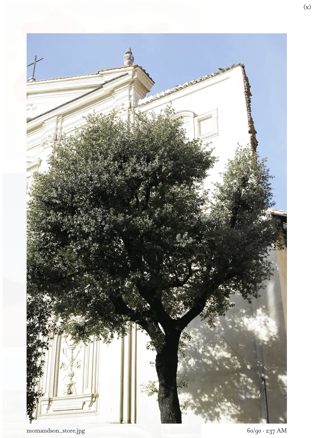
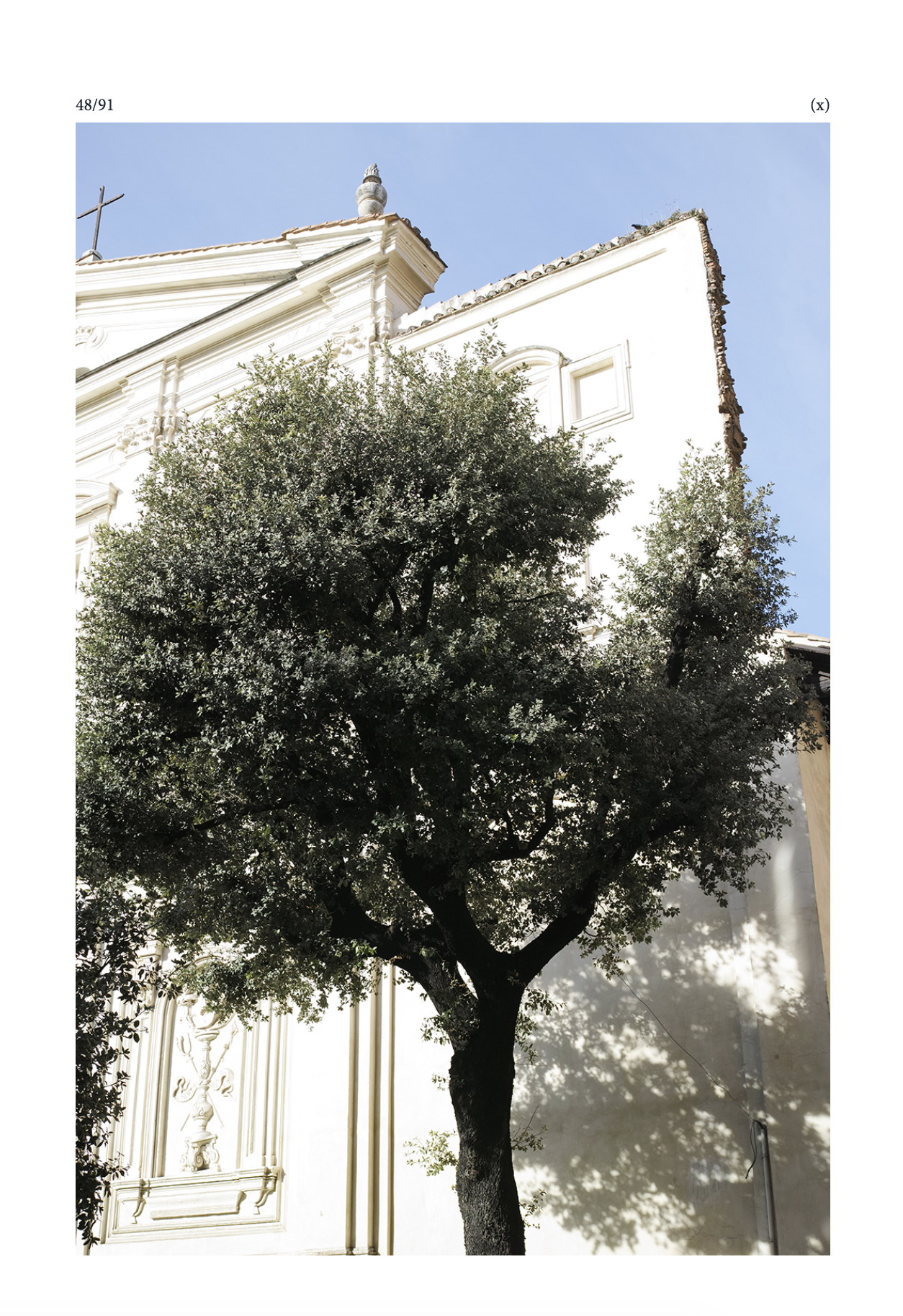
On desktop, the cursor points left/right depending on its position; clicking (or arrow keys) navigates, and closing (x) or pressing esc returns to the selected image.
Lightbox supports videos with a progress bar. Play time is also displayed in bottom right of the thumbnail.
Details
Some other small details that you can find on the site.
Links
Links dim when hovered + they always open in a separate tab.
Back to top
On desktop, a white background is added to "Back to top" so it’s easier to see in the Index. On mobile, this background is removed.
Back to top appears (when scrolled) near the bottom of a long page and returns the user to the top when clicked.
Back Button
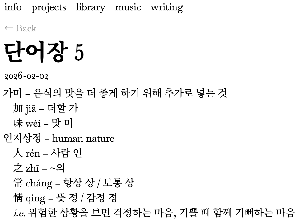
Scrollbar
Originally, the scrollbar was hidden to fix a bug on the Index page (where resizing the window on desktop made the scrollbar flash). Now, this change is applied to all pages across the entire site (the scrollbar is also hidden on mobile).
Language
Korean text is set at 90% of the surrounding text size to balance with English. Korean Note titles are pushed slightly left.
The font used on this site (Minion Pro) does not support some of the pinyin glyphs, so all English and pinyin in the dictionary notes fall back to Noto Serif KR instead (English-only notes are left as is). This font is set at 87.5% of the surrounding text size.
Selectable
Some parts of the site (such as the navbar) are not selectable, so the text cursor does not appear when they are clicked.
Experiments
Some features I experimented with, but ultimately did not include in the website.
Color Info Popup
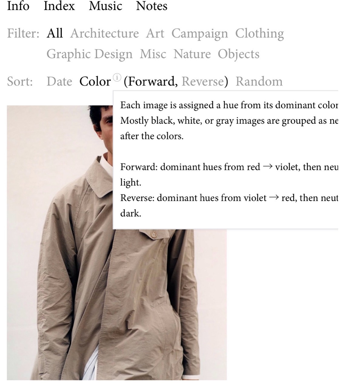
Before, I used an info icon to explain how color sorting works. Not only did the content not fit on the page, the current sort options already open in a popup (so including this icon would make another popup open on the screen). I removed it because that interaction felt too busy on mobile.
Text Size
I couldn't decide whether I liked the gear icon (or if this setting was useful).
Settings gear icon with Text Size S/L
Random Fade Dev Lines
This animation felt a little too distracting.
Randomized fade applied to the Notes tab.
Working with Codex
I started playing with Codex more when working on these changes. More and more of my coding became hands-off and steering Codex to give me what I wanted.
Skills
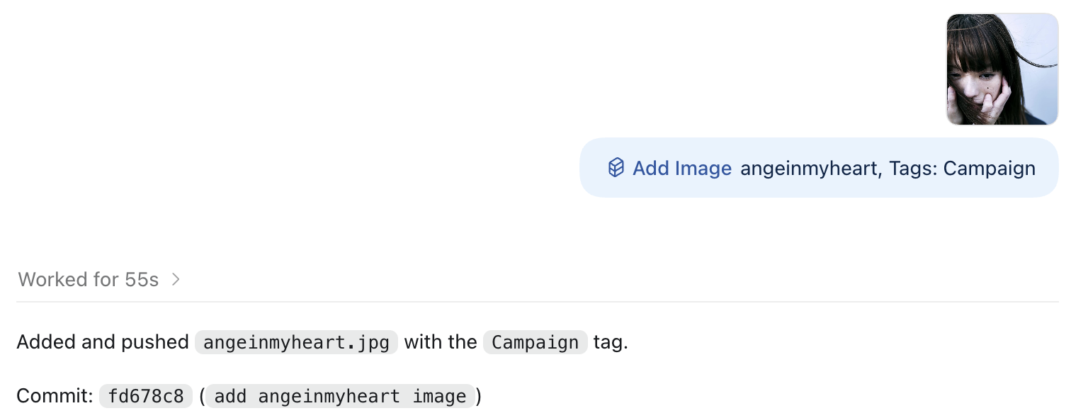
The first Codex skill I set up was for adding images to the library. Before the skill, I had to do the following:
- 1. Upload the image from my phone → computer
- 2. Right-click image to Get Info → write a comment
- 3. Add image tag(s)
- 4. Move image into my image library folder
- 5. Run the image metadata script
- 6. Commit and push my changes
Now, I just drag the image into Codex, provide the title and tags, and the skill handles the rest. The skill also supports comments, although I no longer display them in the image lightbox.
I also set up a separate skill for adding new playlists, where I provide the playlist link and a list of artists. I considered setting up a script to extract the artists automatically, but I wanted more control over the artist naming. The skill checks the provided artists against artists from existing playlists to make sure spelling stays consistent (i.e. dibia$e).
Even without custom skills, Codex was able to crop, trim, label, and mute the audio for all videos added to this note, as well as center and align media content, including the side-by-side images (it fetches appropriate skills on its own). I was very impressed by this.
Process
A lot of work went into redesigning the Index (and Info) pages. At this point, I stopped looking at the React code and focused on describing the behavior I wanted, testing the result, and steering Codex when something didn’t look or work right. This was different from how I had worked on the site before, but let me iterate much faster.
A few things helped me control Codex:
- 1. A lot of issues with animations came from animation constants being spread out across different files. I consolidated all the animation constants into a single file.
- 2. Occasionally, I asked Codex to simplify the code. Since Codex shows you the changed files, I could easily revert the changes if they broke existing behavior.
- 3. If new behavior strayed too far from what I wanted, I had Codex reference the deployed website and change my branch to match the existing behavior.
Remote Development
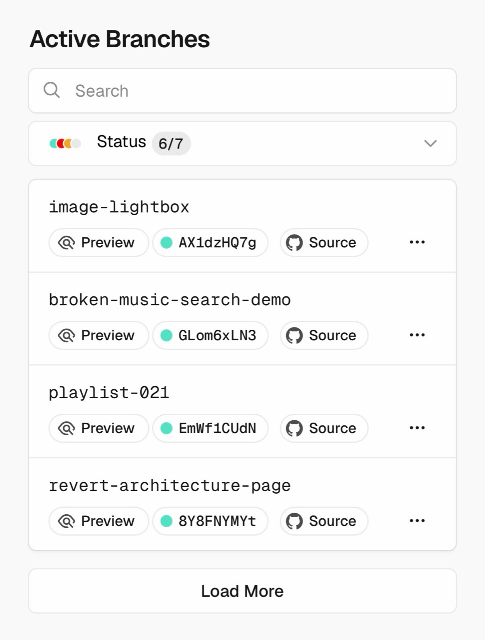
I have my code deployed on Vercel, which lets me preview website changes on my phone through their dashboard. I set up remote development with Codex, which lets me chat with Codex on my phone + work on my website while lying down or walking around. The one caveat is that Codex must still be running on my computer (so my computer cannot be closed).
Ideally, Codex could open the website locally (it does this just fine on the computer + you can see computer use in real time), but there seem to be some issues when trying to open locally on mobile.
I’ve been using previews a lot since I know that most (if not all) people visiting the site will be coming from Instagram on mobile.
References
I spent a lot of time looking at other websites. Some interesting findings:
- 1. Architecture firms have very clean and easy to navigate websites
- 2. Some of the design studio websites take a long time to load
Here are some of the website elements I incorporated into this site.
| Website | Reference |
|---|---|
| pinerofficial.com | Font |
| davidchipperfield.com | Grid, list, filter |
| nicholaschmidt.com | Information reveal |
| annapaolaguerra.com | Initial reference for the lightbox |
| fang-group.net | Bolding the selected navbar item |
| door.link | Numbering music playlists using 000 |
| romanpell.com | Lightbox image counter in the top left |
| ellenole.com | Lightbox (x) and bidirectional cursor (desktop) |
| jjjj-image-library.com | Index column design + image reveal animation |
| Other websites | |
| sorbarasnewyork.com | Site color picker |
| flatm.kr | kr/en language option |
| 100gigs.org | Not active anymore, but I remember liking the video player |
| neutra-vdl.org/explore/archive | Hovering over an image shows the image preview of the next one |
| o-r-k-r.kr | — |
| muon-office.com | — |
| buero.paris | — |
| thomasphifer.com | — |
Closing
Thank you for following my work on ktaetaetaetae.
I’d also like to thank Jason and Nicholas for their feedback.